Poster designs (L-R)
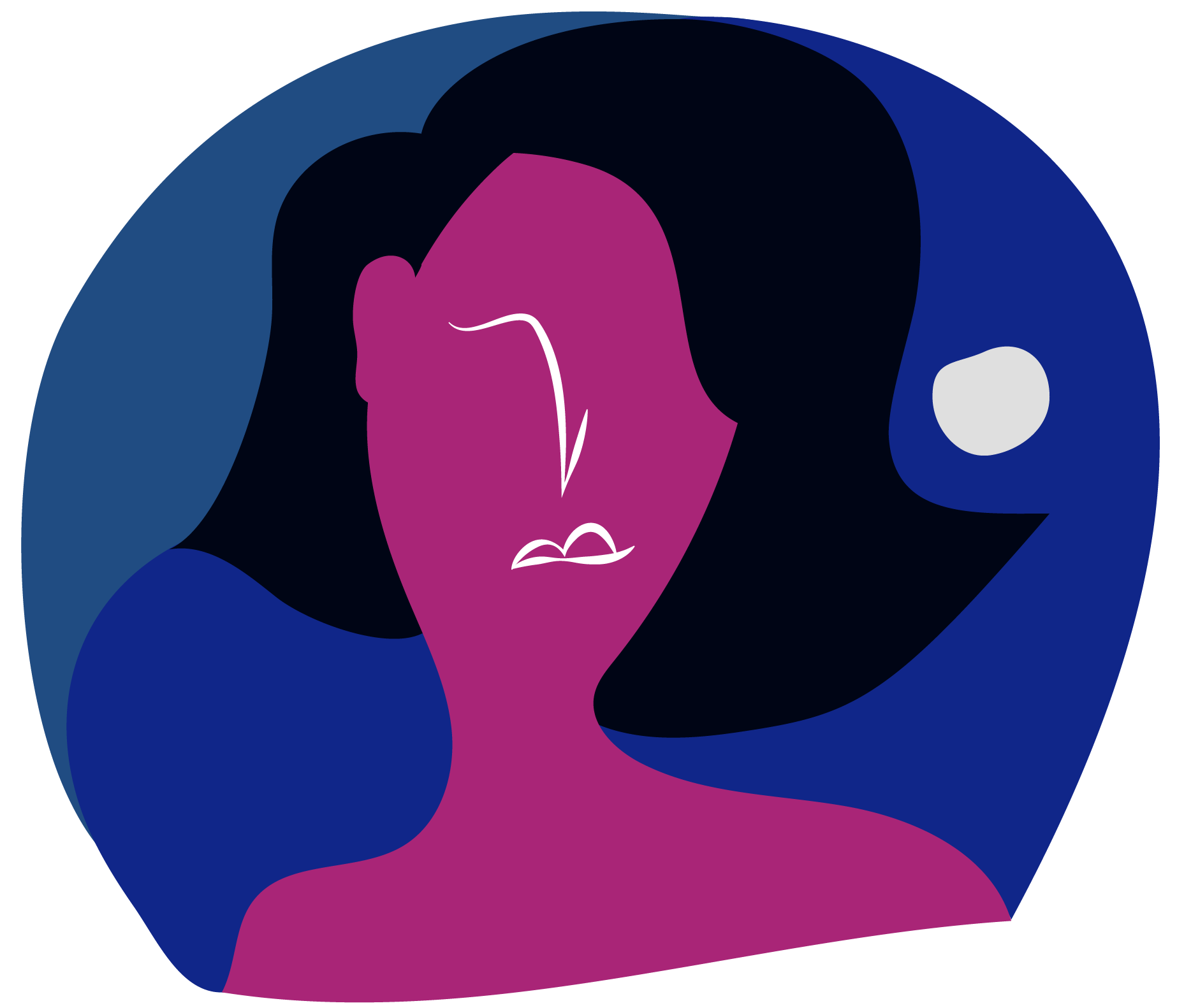
Typography Poster
This poster was developed in Adobe Photoshop and showcases a translation of a quote from John Maeda's book Redesigning Leadership. The saying itself inspired typographical choices that were applied to this poster. Colours and different font sizes guide the viewers' gaze up (and above up) and the shape of the text is reminiscent to that of Japanese Kanji characters used to write the original text. This quote encourages its readers to never stop at their accomplishments - once something has been achieved, there is always a new step or height that can be reached on the way to self-discovery.
This poster was developed in Adobe Photoshop and showcases a translation of a quote from John Maeda's book Redesigning Leadership. The saying itself inspired typographical choices that were applied to this poster. Colours and different font sizes guide the viewers' gaze up (and above up) and the shape of the text is reminiscent to that of Japanese Kanji characters used to write the original text. This quote encourages its readers to never stop at their accomplishments - once something has been achieved, there is always a new step or height that can be reached on the way to self-discovery.
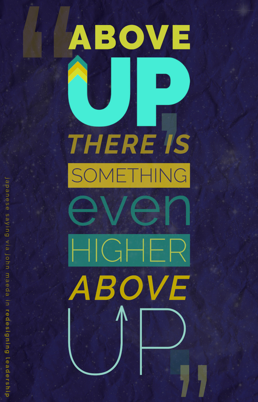
Project Vision: Digifest Poster
(created for the Humber College: School of Media and Information Technology)
Created a poster for Humber's student Peter Tran to showcase his VR game aimed at visually impaired individuals. This was an interesting project and challenged me to creatively interpret a game that has very few visual cues.
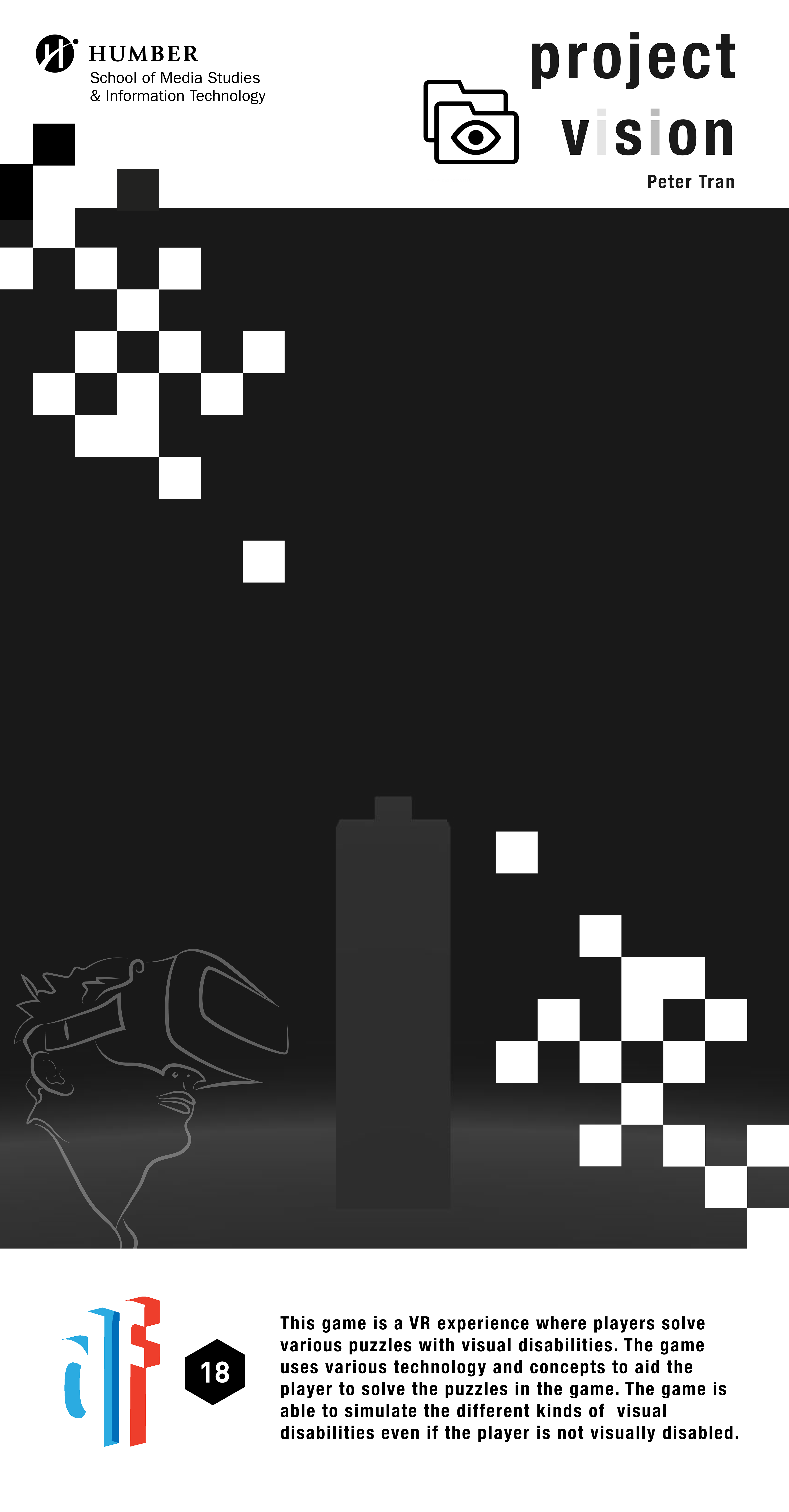
The Reckoning Screening Poster
(created for the Humber College: School of Media and Information Technology)
Created a poster to advertise an upcoming screening of The Reckoning and Q&A regarding the film. Combined both Humber branding standards and the aesthetic of the original poster.
(created for the Humber College: School of Media and Information Technology)
Created a poster to advertise an upcoming screening of The Reckoning and Q&A regarding the film. Combined both Humber branding standards and the aesthetic of the original poster.
Typography Poster
Project Vision: Digifest Poster
The Reckoning Screening Poster
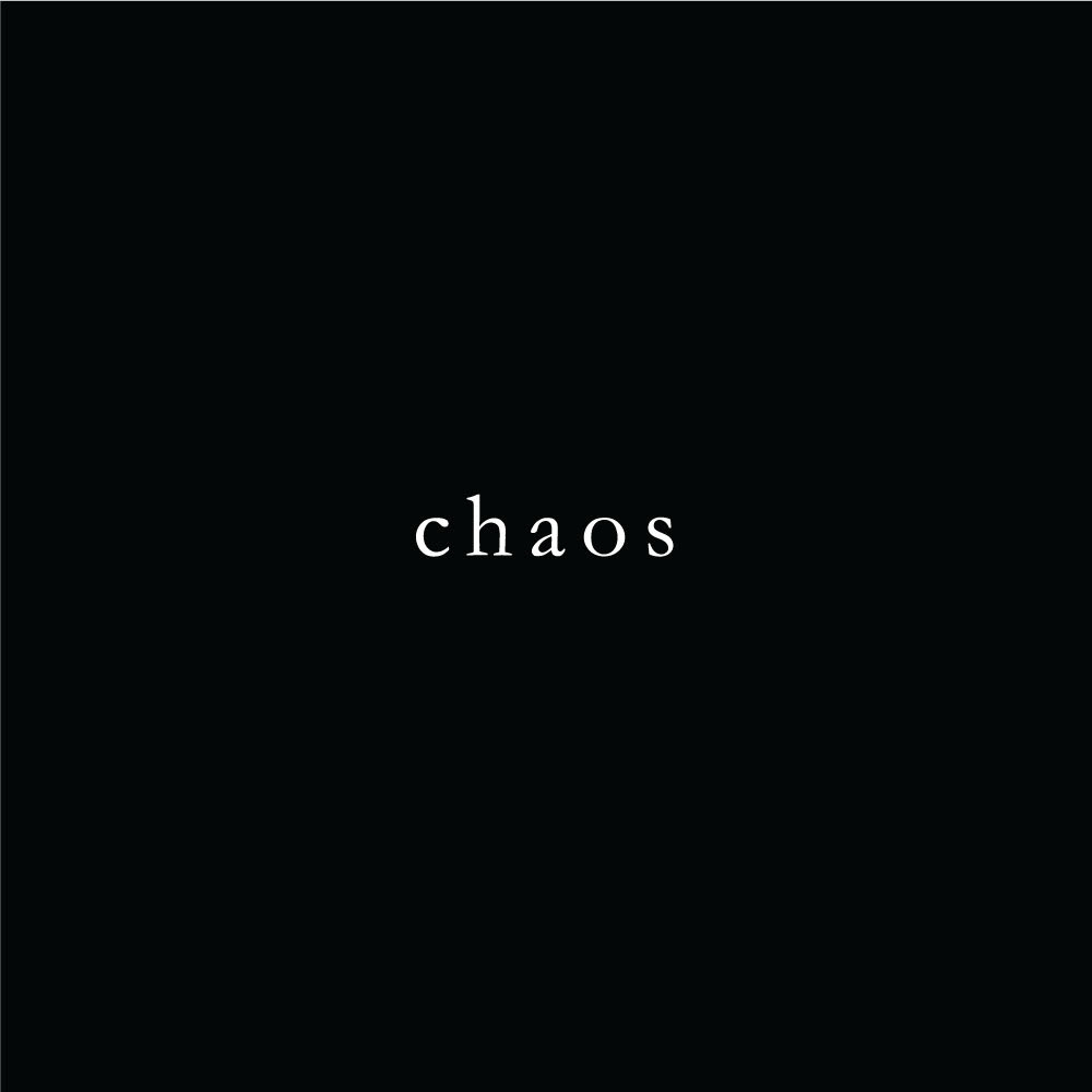
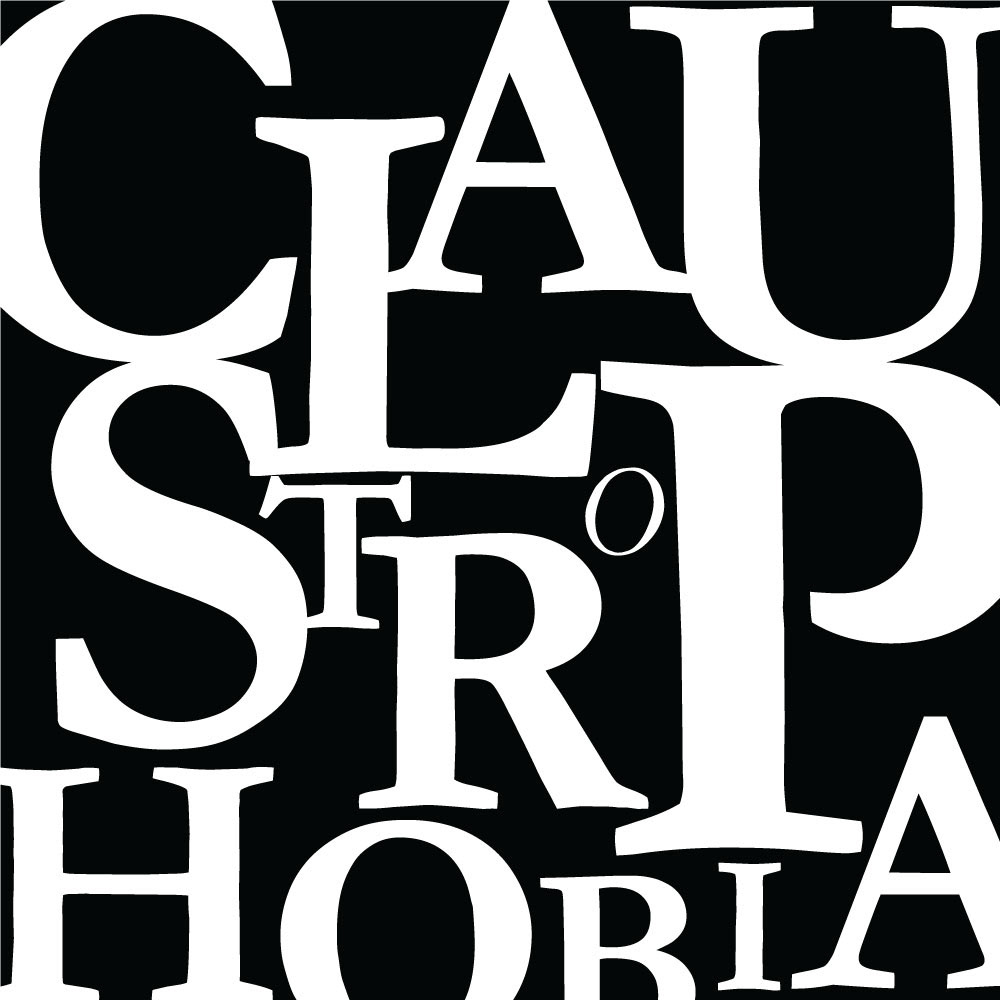
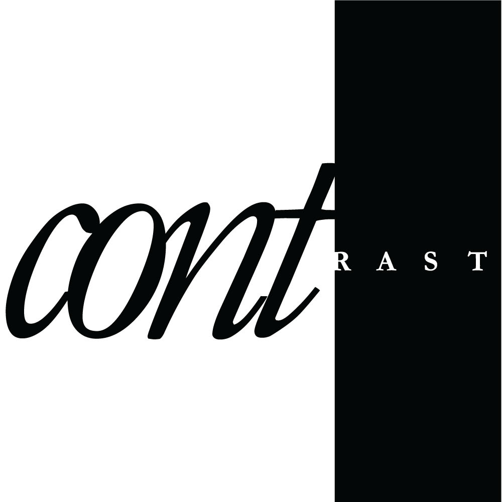
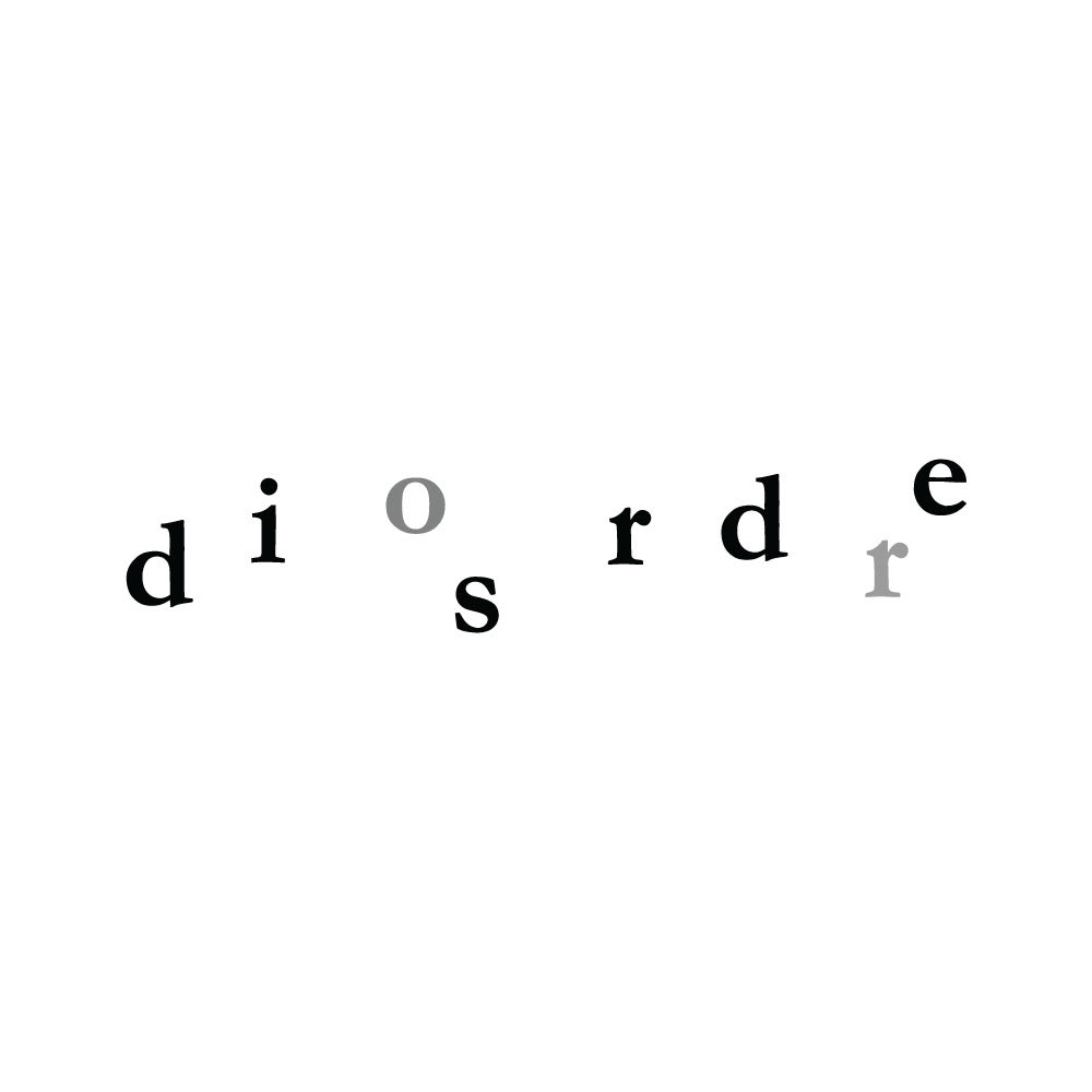
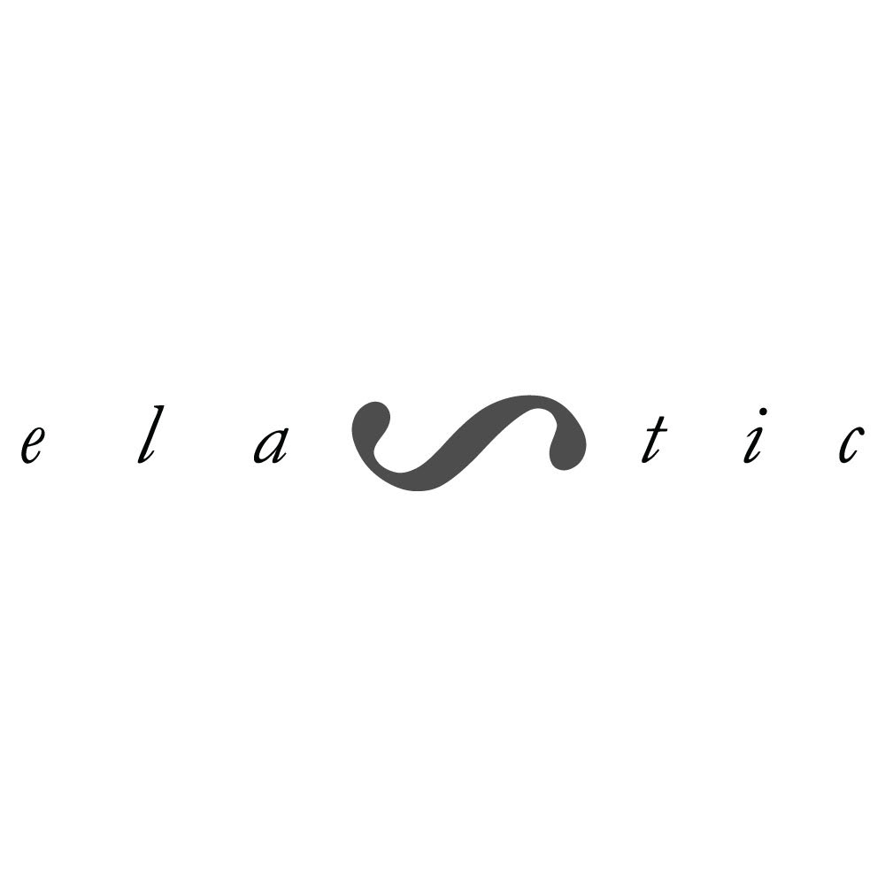
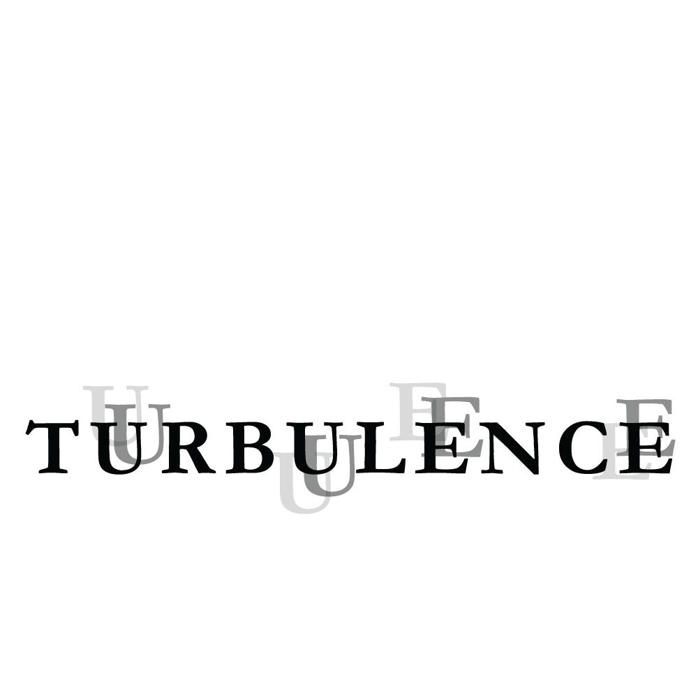
Expressive Typography
An exercise in expressing a chosen word through typography only. The challenge was to use a single font and a limited colour pallet of black, white, and shades of grey.
An exercise in expressing a chosen word through typography only. The challenge was to use a single font and a limited colour pallet of black, white, and shades of grey.
Simple Illustrations
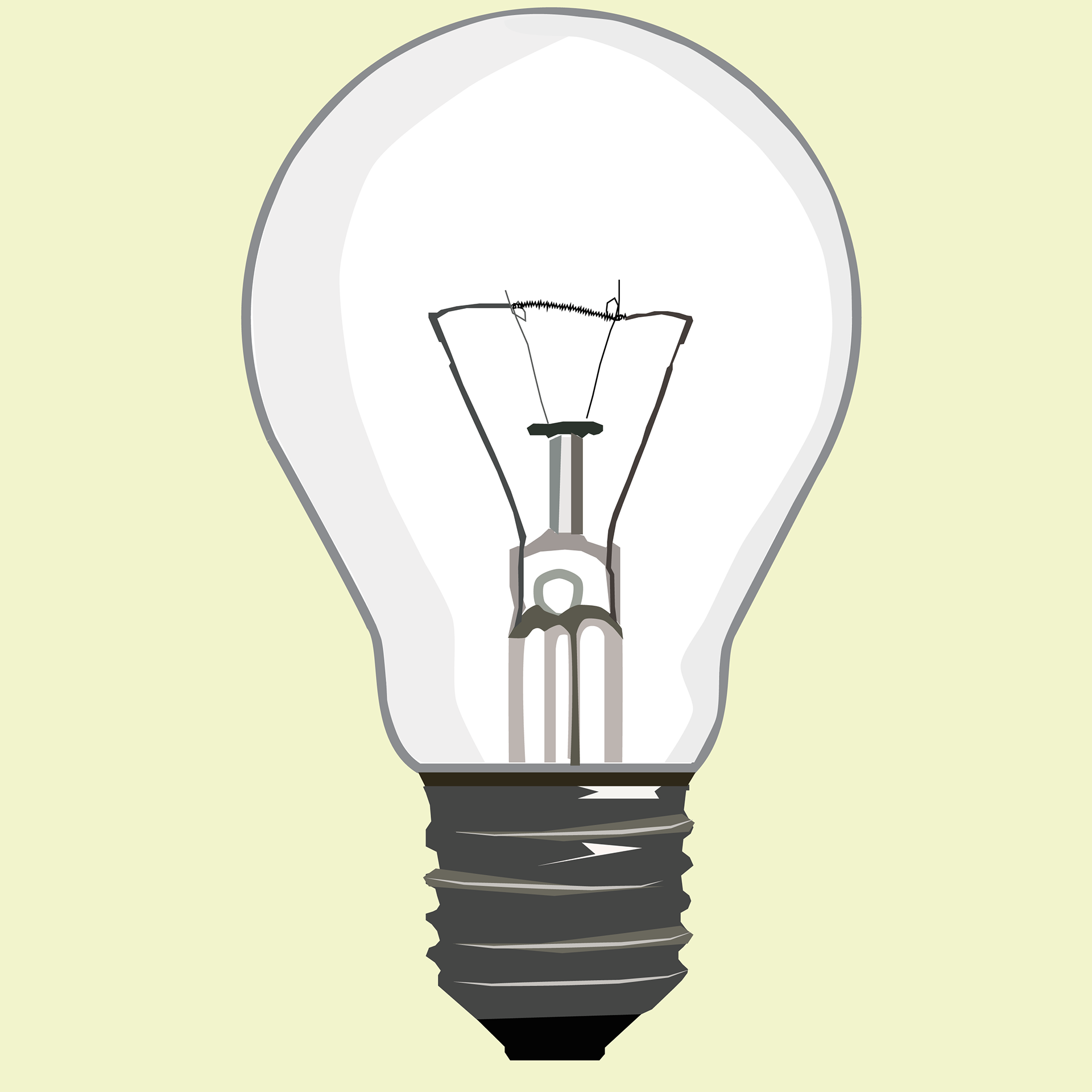
Lightbulb Illustration
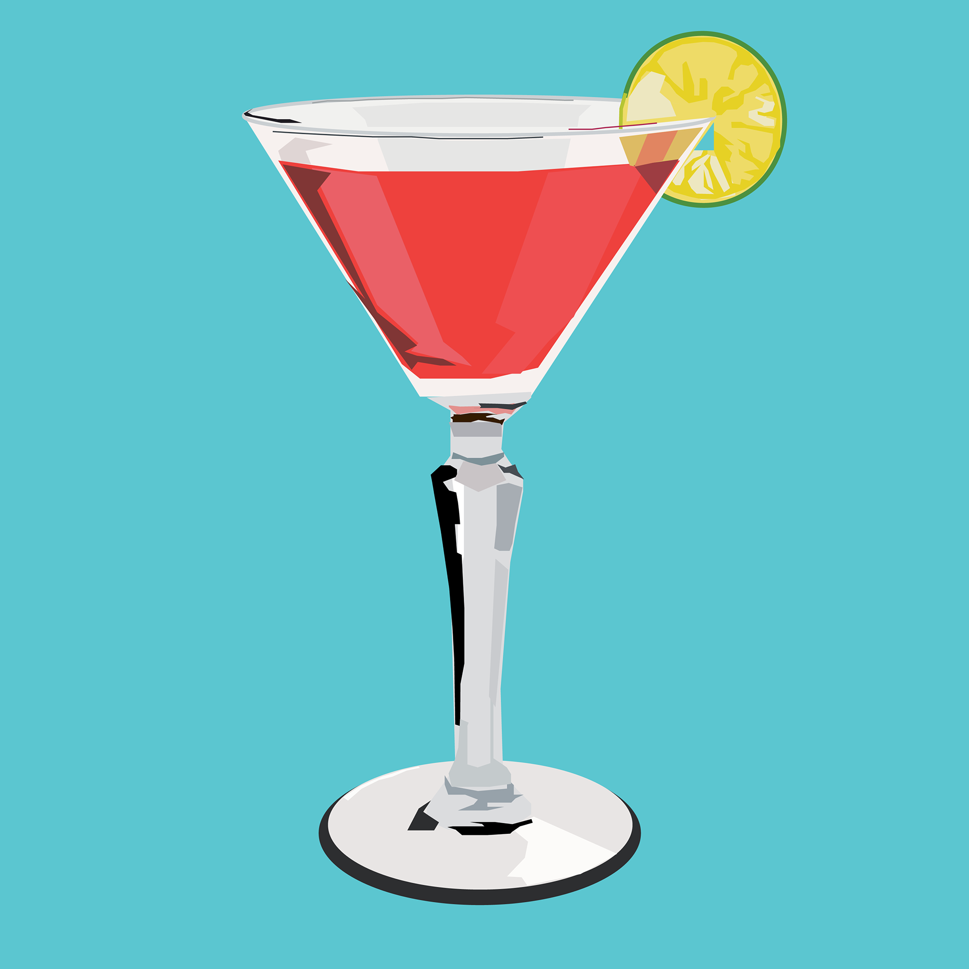
Cocktail Glass Illustration

Coffee Mug Illustration
IKEA App Icon Design
These icons were designed to be used in a future IKEA mobile app. To keep the colour scheme clean, white and grey were added to IKEA's iconic blue and yellow. These icons needed to be simple and recognizable to make the user experience quick and straightforward.
These icons were designed to be used in a future IKEA mobile app. To keep the colour scheme clean, white and grey were added to IKEA's iconic blue and yellow. These icons needed to be simple and recognizable to make the user experience quick and straightforward.

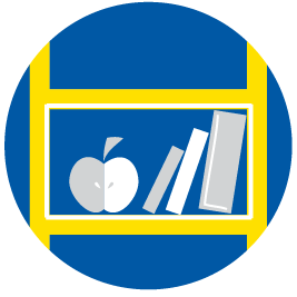
IKEA Icon for Baby Items

IKEA Icon for Kitchen Items

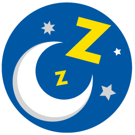
IKEA Icon for Laundry Room Items
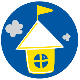
IKEA Icon for Office Items
IKEA Icon for Bedroom Items
IKEA Icon for Kids' Room Items
Verkinski Logo Animations
Verkinski is a variation of my name and also the name of my personal brand. Triangles were chosen for their strong shapes and similarity to the letter V. Multiple triangles of different colours represent the elements that go into the creative design process, elements and ideas that sometimes seem to come from different points of view, come together to create a cohesive and dynamic concept.
Verkinski is a variation of my name and also the name of my personal brand. Triangles were chosen for their strong shapes and similarity to the letter V. Multiple triangles of different colours represent the elements that go into the creative design process, elements and ideas that sometimes seem to come from different points of view, come together to create a cohesive and dynamic concept.
Verkinski Logo Animation #1
Verkinski Logo Animation #2
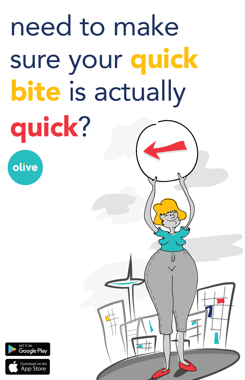
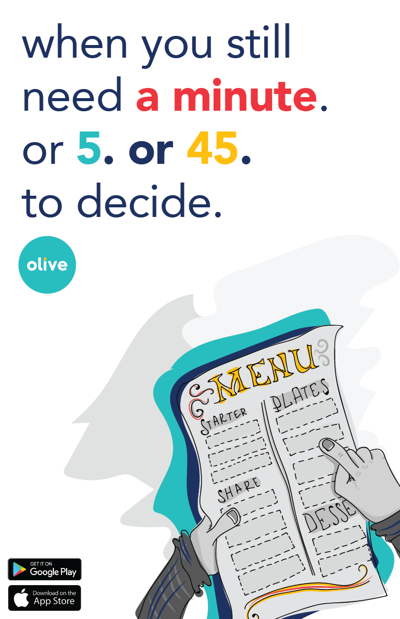
olive
"olive" was a final-year capstone project I worked on alongside three of my classmates. We created a concept for a 'takeout app for dining in,' which would allow users to preorder their food before they got to a restaurant. My role was to create overall branding and marketing pieces for the app, such as posters, branded persona profiles, and onboarding animation (which was later converted into a Lottie file and used in the final prototype).
"olive" was a final-year capstone project I worked on alongside three of my classmates. We created a concept for a 'takeout app for dining in,' which would allow users to preorder their food before they got to a restaurant. My role was to create overall branding and marketing pieces for the app, such as posters, branded persona profiles, and onboarding animation (which was later converted into a Lottie file and used in the final prototype).
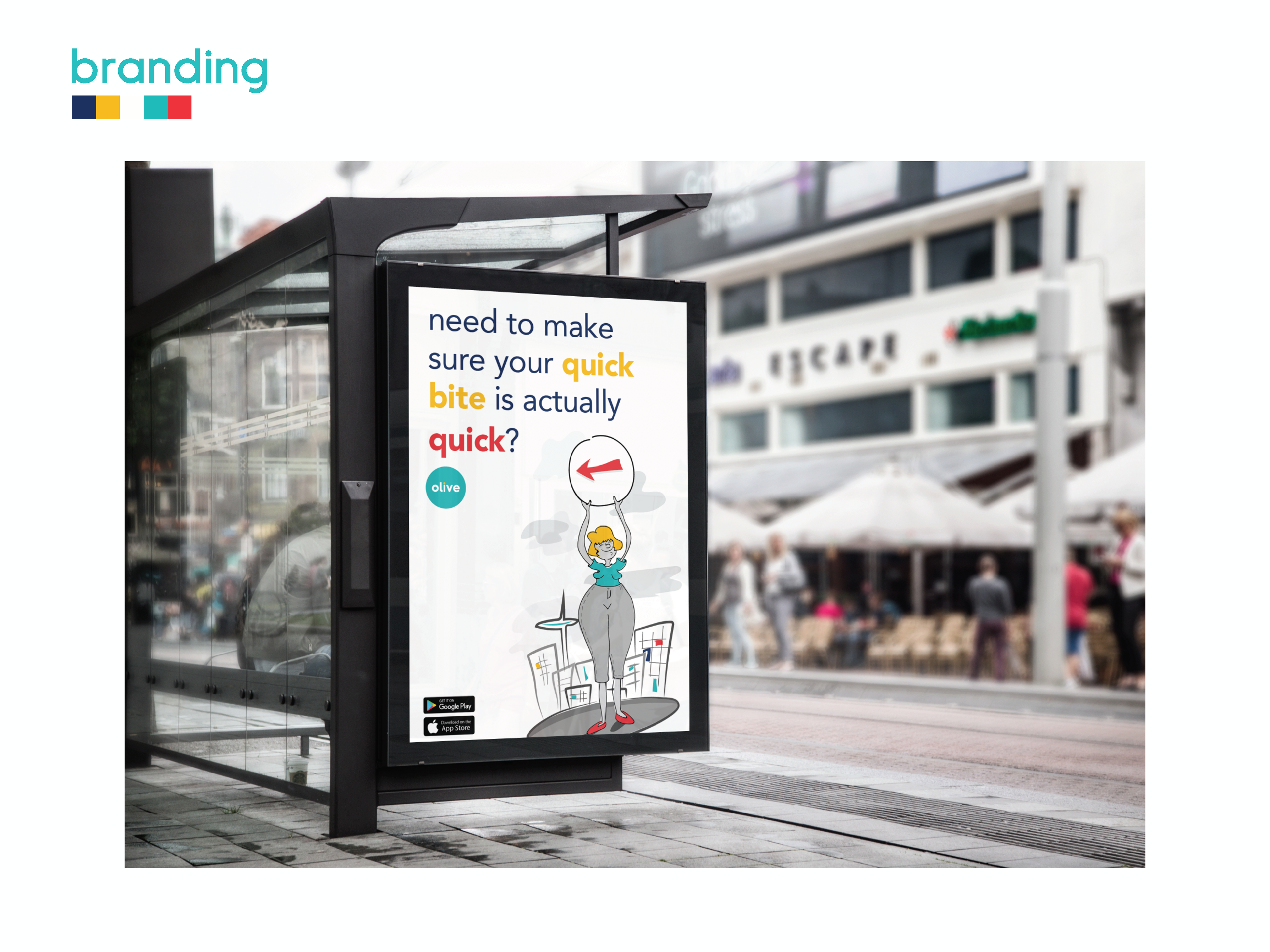
Mockup of a Bus Shelter Poster for the olive App
olive App Promotional Poster
olive App Promotional Poster
Animations for the app's onboarding